
Innit.
A brand-new audio startup with software to level up gaming sound — and nothing built yet. As UX lead and researcher I took it from the ground up: a full website and a Windows desktop app, backed by 8 months of research.
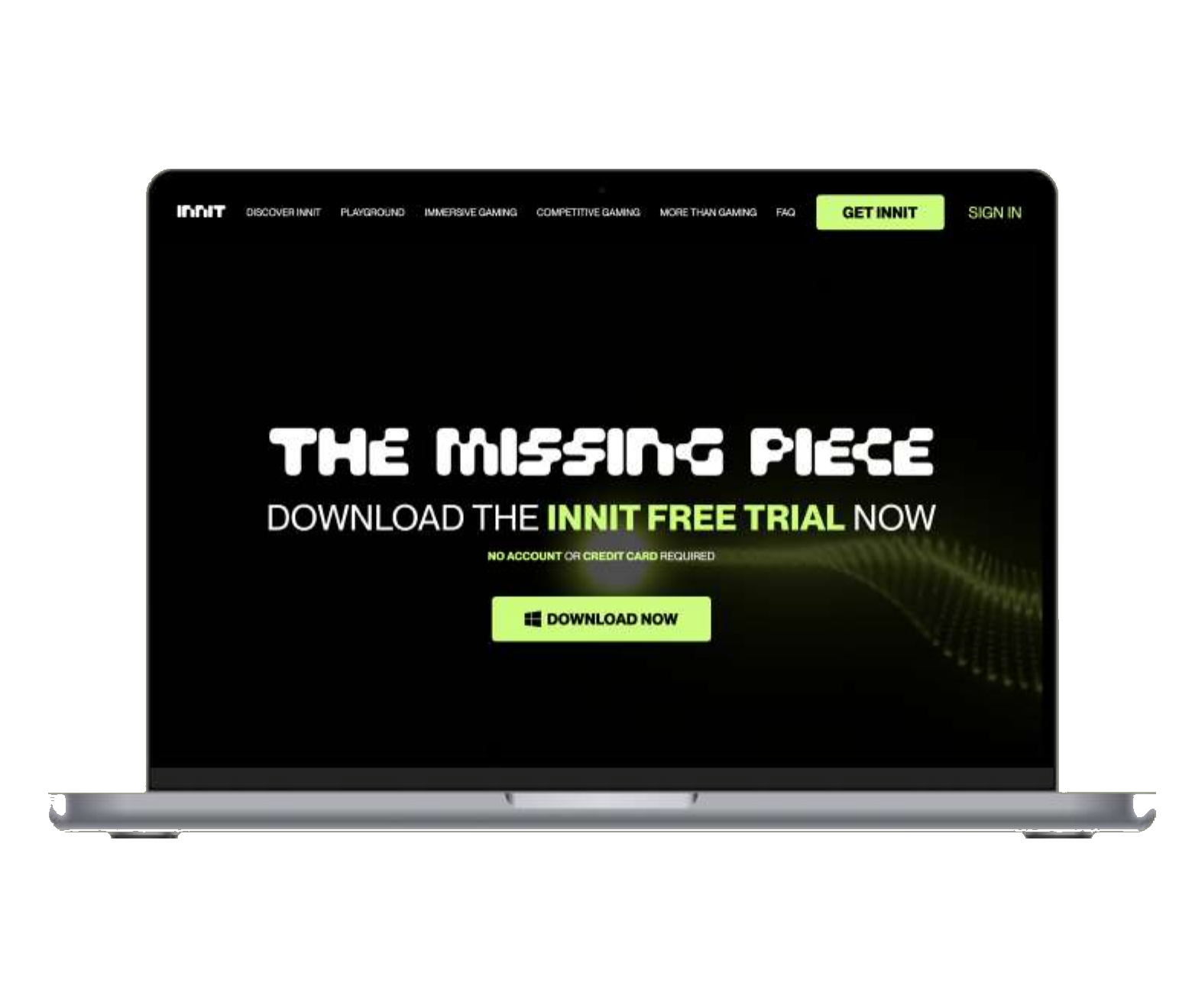
Innit is revolutionary software that enhances the audio experience in headphones, aimed primarily at gamers. The company was brand new — no developed product, no website, no clear way to even explain what it was. They needed a team to own the landing page, the full website, and the desktop app where the audio experience lives, working alongside a separate branding and marketing team.
My role
UX lead and UX researcher — leading research from scratch and owning the design across website and desktop app.
The brief
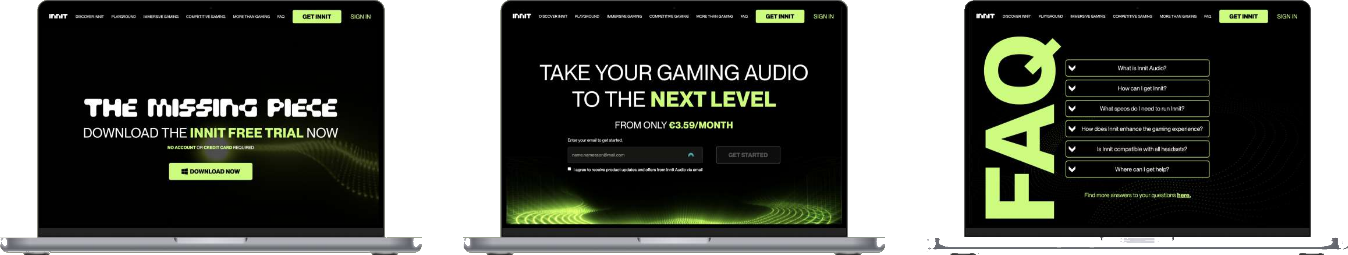
A landing page to generate interest, a full website, and the desktop app UI — the entire design process, end to end.
Hardest part
Showcasing a product so new that even the target users struggled to explain what it actually was.
Selling something nobody could describe
With no finished product to point at, the website had to make an abstract audio technology feel concrete and worth trying — and the desktop app had to make the experience genuinely easy to use. Both had to be built on real understanding of how gamers relate to sound, which meant research had to come first.
Three rounds, from the ground up
I owned research end to end: defining the audience, writing the questions, recruiting, running sessions, transcribing, analysing, and presenting. It ran in three rounds.
In-depth interviews
How gamers interact with sound — pain points, what feels effective, and where sound truly matters.
Product testing
Alpha and beta product testing alongside interviews, run across multiple rounds with a recruited panel.
Usability testing
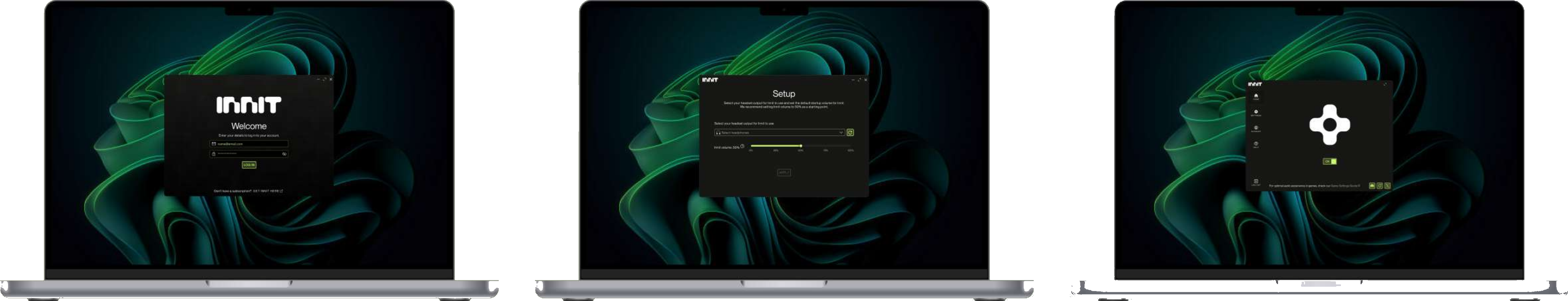
Usability tests on the desktop app surfaced that users mistook the home page for settings — so we redesigned it.
From there: defining the information architecture of the website, mapping user flows and the desktop app, and figuring out how to actually showcase the product — all before a pixel of high-fidelity design. Pen and paper, then Figma and Miro.
A full website and a desktop app
Live, and built on evidence
SUS usability score on the desktop app
Research participants across alpha and beta
Products shipped — full website + Windows app
The delivery was well received by the client and end users alike — a conversion-focused website and an app that's genuinely easy to use. Today it's up and running.
This was my longest and most demanding project — building something that didn't exist yet, with a lot of responsibility on my shoulders. The lessons that stuck: keep a clear head when the scope is huge, treat communication as the real deliverable, and stay the advocate for users when everyone else is focused on shipping.