
OFFSET.
iOS · A philosophical field guide
A native iPhone app for when thoughts get stuck. Four philosophical perspectives on everyday uncertainty, designed to help you see the same situation differently.
- iOS
- Working iPhone app
- Design & development
- My role
- Pre-release
- Independent project · 2026
01 / THE PREMISE
A little space changes what you see.
OFFSET does not prescribe an answer. It creates enough distance to see the same situation through Buddhism, Taoism, Existentialism and Stoicism.
NO AI CHAT · NO FEED
NO STREAKS · NO PERFORMANCE LOOPS
02A / WHY I BUILT IT
I didn’t need more advice. I needed distance.
When I got stuck in a decision, I could find endless opinions — but little that helped me see the situation differently.
02B / THE PROBLEM
Most tools try to give you the answer.
Feeds, advice and chat tools add more input. I wanted to reduce the noise without turning reflection into another habit to maintain.
02C / WHAT I WANTED TO MAKE
A small tool for seeing the same thing differently.
01
Personal
Start with what is actually on your mind.
02
Plural
Offer four lenses instead of one correct answer.
03
Lightweight
Designed to offer one useful thought in under a minute.
03 / CORE FLOW
From stuck to perspective.
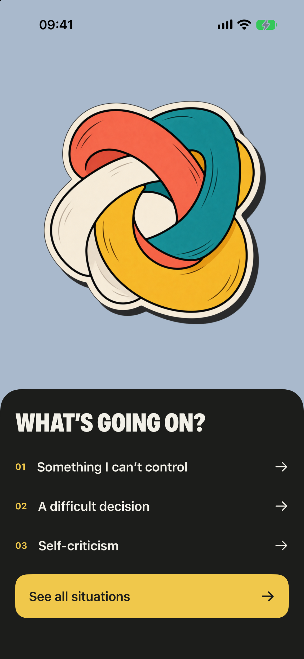
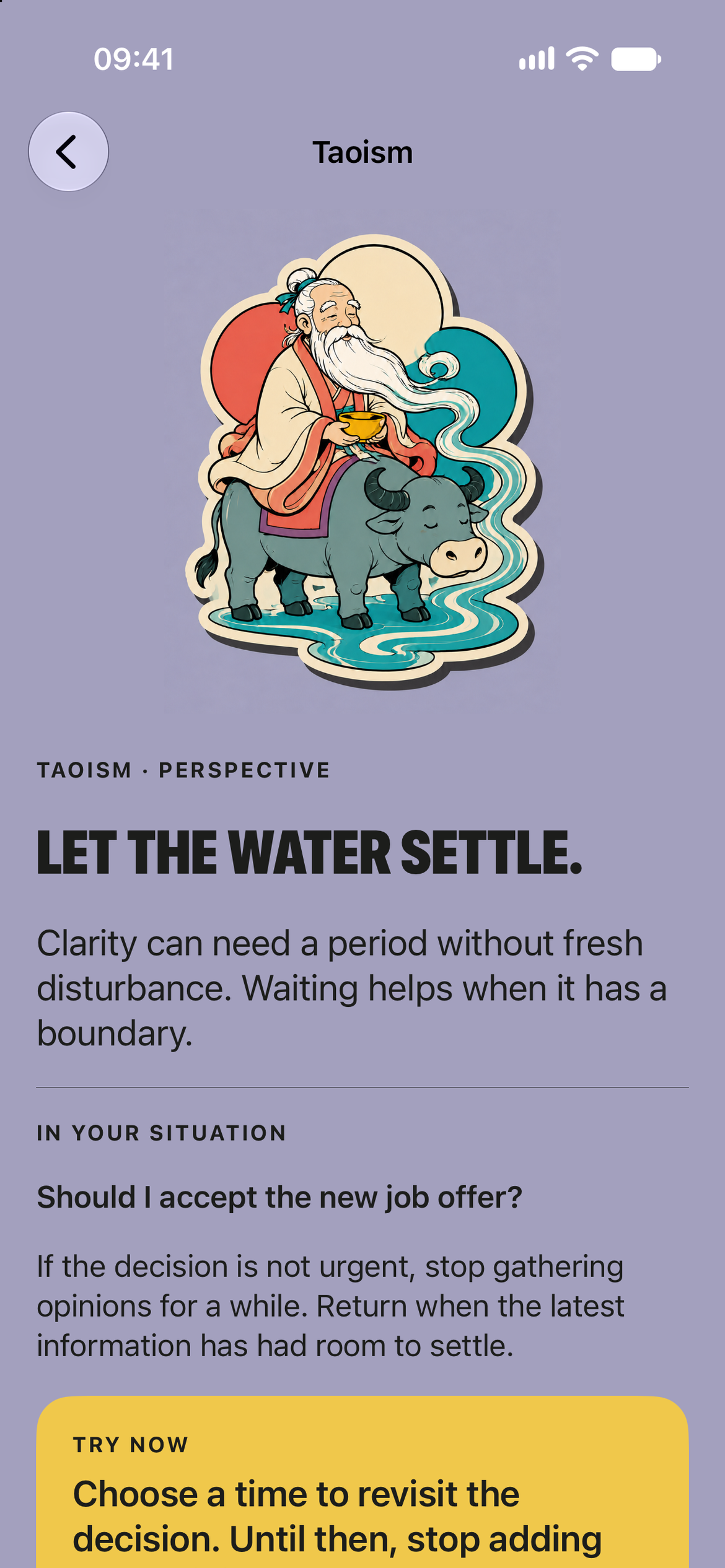
The interface removes decisions before it adds perspective. Choose what is happening, write it in your own words, then move through four lenses.
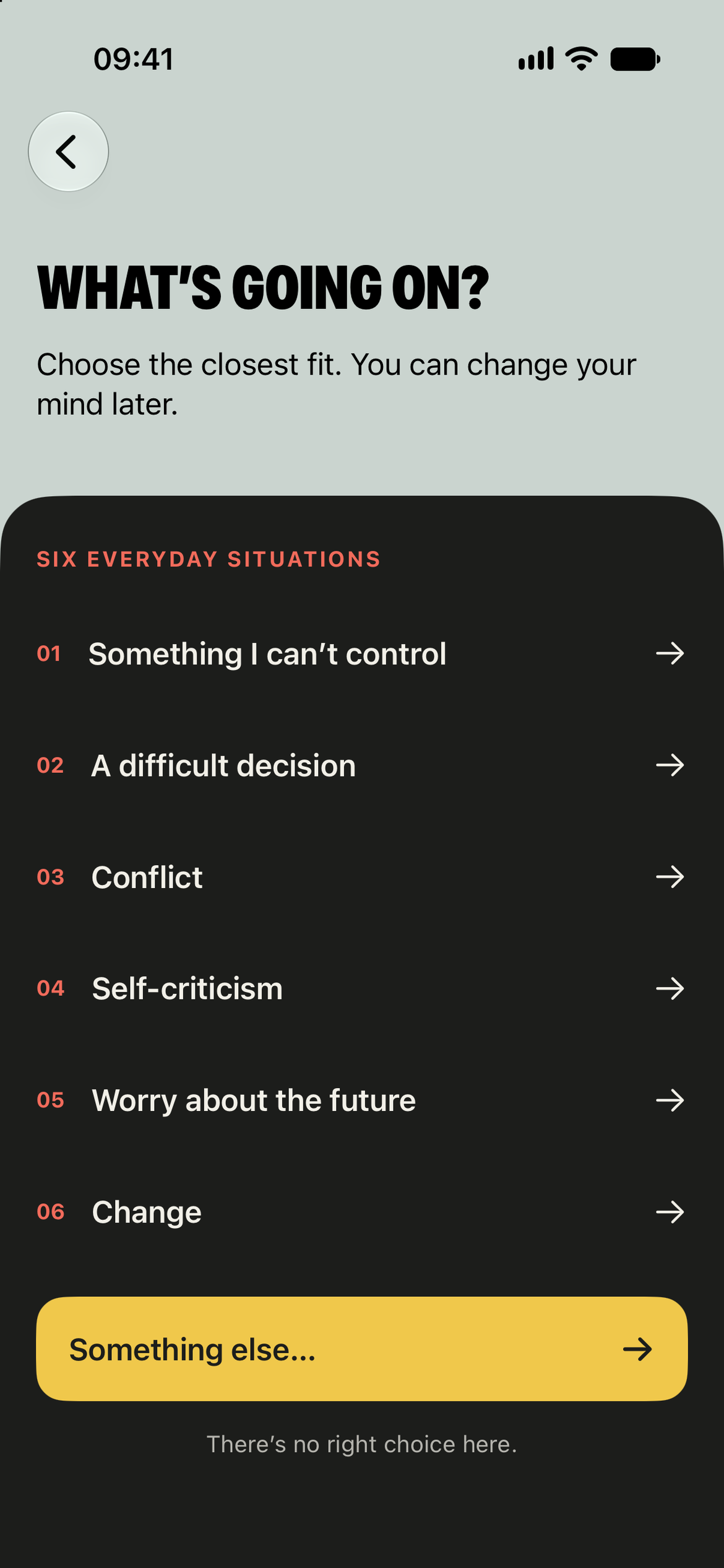
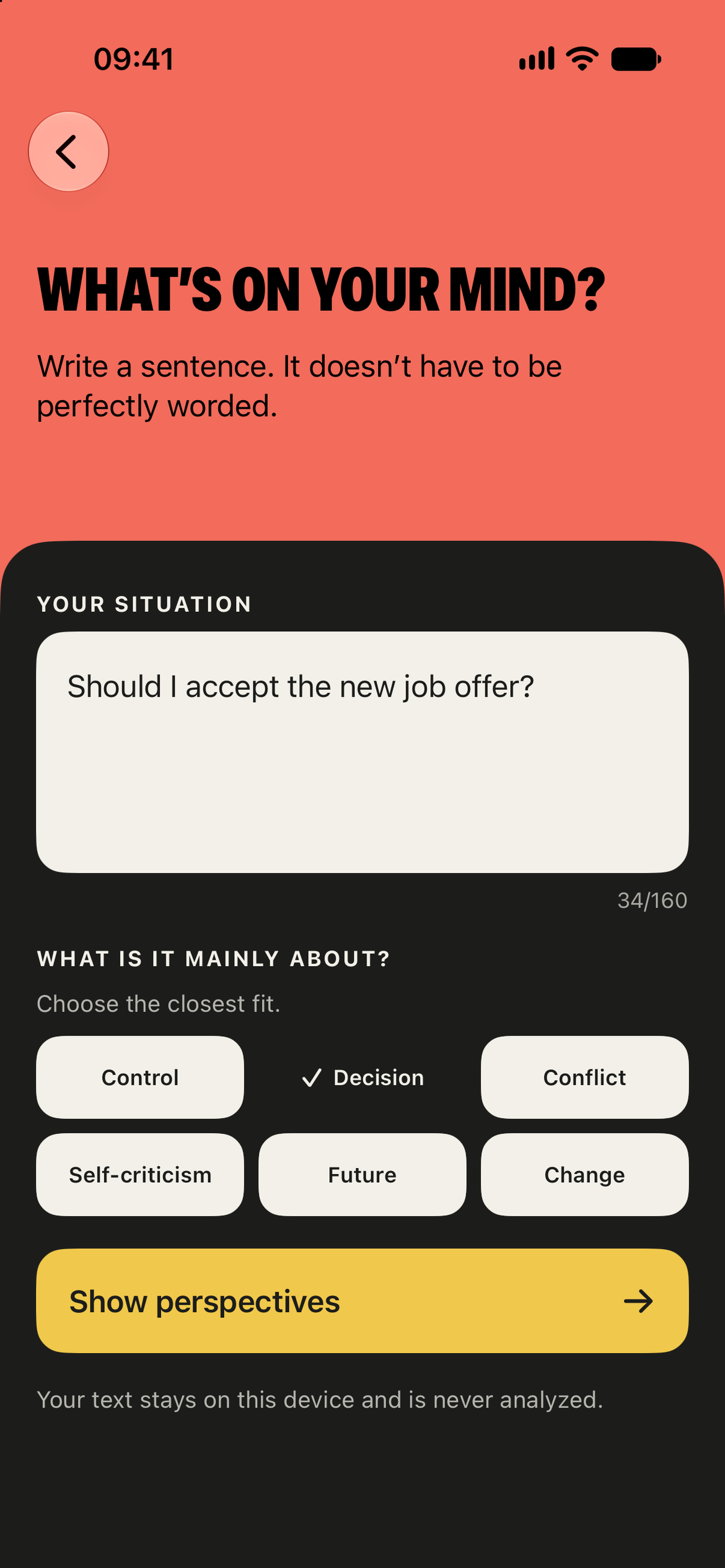
Four steps from arriving with something on your mind to seeing it differently.
04 / INTERACTION
Start with the problem. The perspectives follow.
Most people do not arrive knowing whether they need a Buddhist, Taoist, Existential or Stoic response. OFFSET begins with a question and lets the lenses reveal themselves.
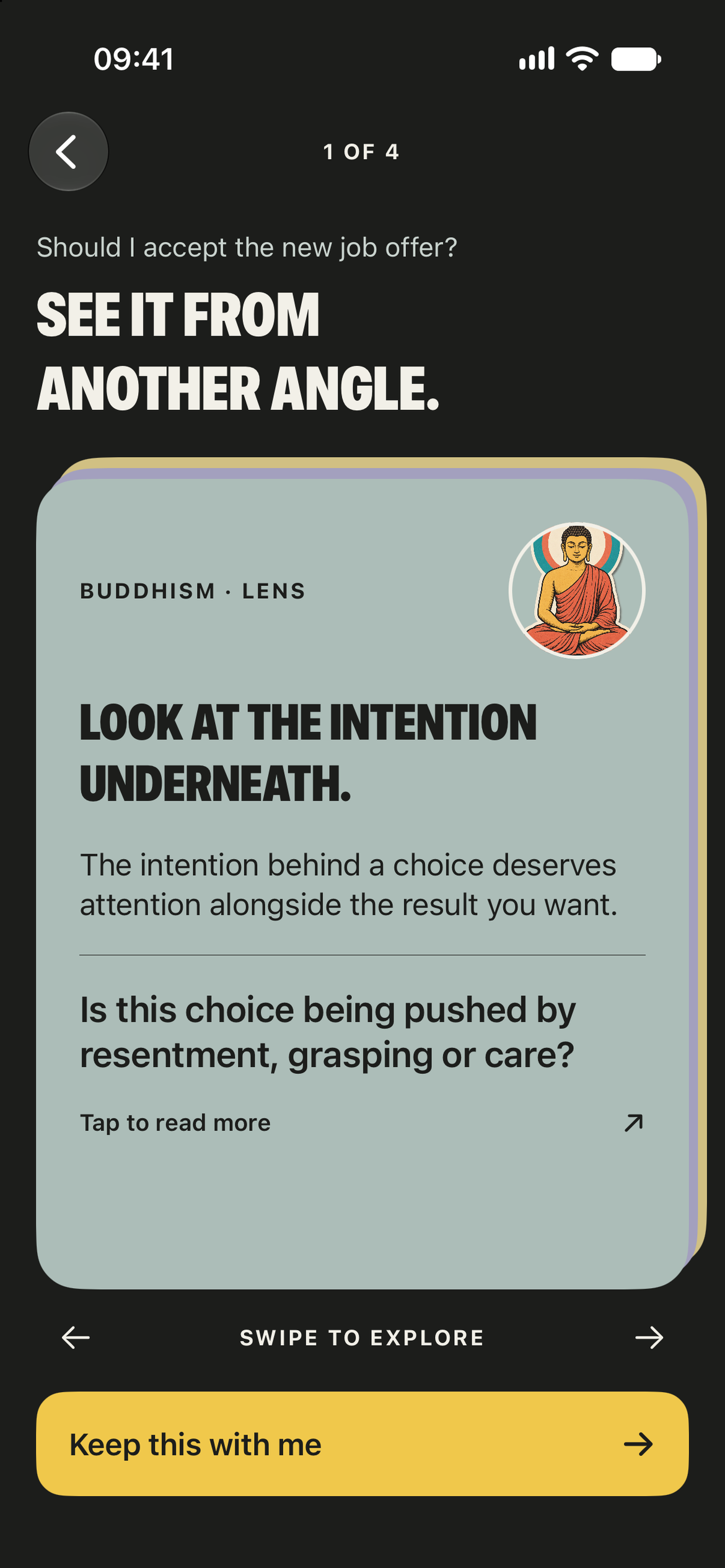
STACKED CARDS SIGNAL THE GESTURE
VISIBLE 1 OF 4 ORIENTATION
VOICEOVER PREVIOUS / NEXT ACTIONS
REDUCE MOTION USES OPACITY
05 / KEY DESIGN DECISIONS
Three choices shape the experience.
The product stays intentionally narrow. Each decision removes friction instead of adding another feature layer.
01
Four lenses, not one answer.
The app avoids presenting one philosophy as correct. Swiping lets different perspectives sit beside each other without ranking them.
02
One primary action per view.
Each screen asks for one next move. No tab bar, dashboard or competing navigation interrupts the reflection.
03
Depth stays optional.
The short flow always comes first. Longer editorial reading is there only when the user wants it.
06A / VISUAL SYSTEM
Color creates pace.
Each color has one job: sage for calm, coral for misreadings, mustard for actions. Nothing is colored just for decoration.
SEE IT FROM ANOTHER ANGLE.
DISPLAY / DIRECT / COMPRESSED
-
CHARCOAL
CONTENT / DEPTH
-
SAGE
HOME / CALM
-
CORAL
MISREADING
-
MUSTARD
ACTION
-
VIOLET
APP ICON
06B / COMPONENTS + FOUNDATIONS
One system. One clear next step.
CORE COMPONENTS


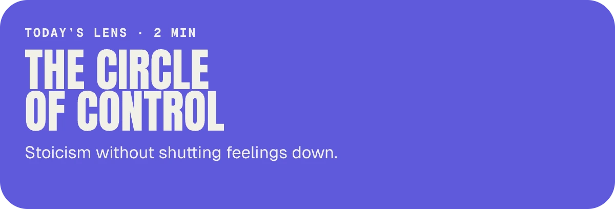
FOUNDATIONS / IOS
- Grid
- 390 pt / 20 pt gutter
- Spacing
- 8 pt system
- Radius
- 16 pt / 28 pt
- Touch
- 44 × 44 pt min
- Type roles
- Display / body / meta
- Accessibility
- AA / color never alone
07A / READING DEPTH
Fast when you need it. Deep when you want it.
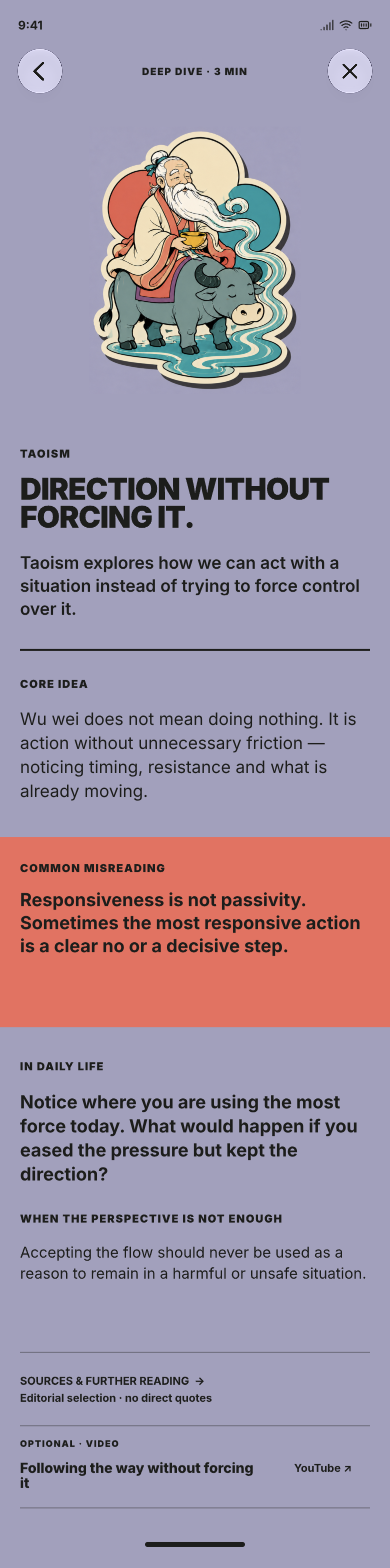
The same curated ideas power the short situation flow and longer editorial reading. Depth is available, never imposed.
CORE IDEA
COMMON MISREADING
IN DAILY LIFE
WHEN THE PERSPECTIVE IS NOT ENOUGH
SOURCES & FURTHER READING
07B / ANCHOR
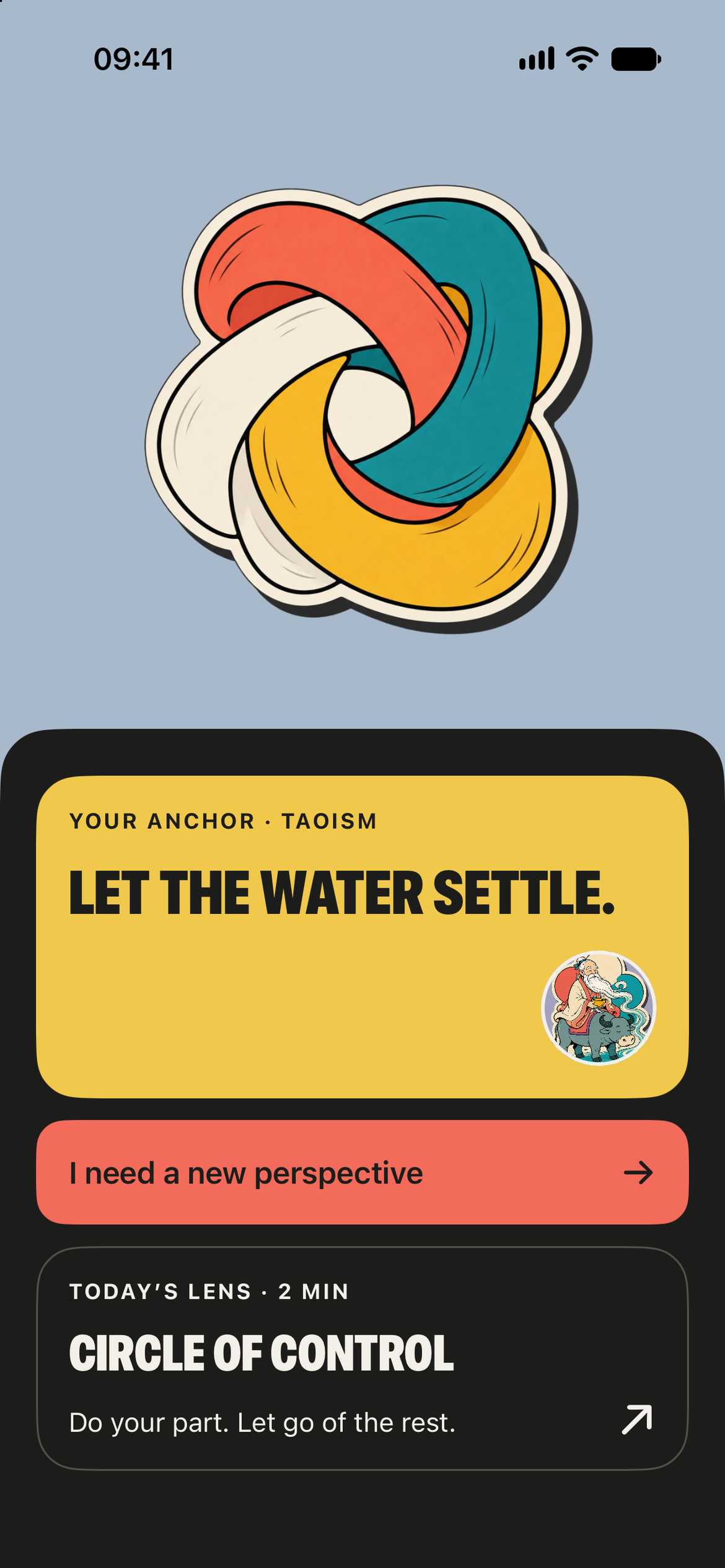
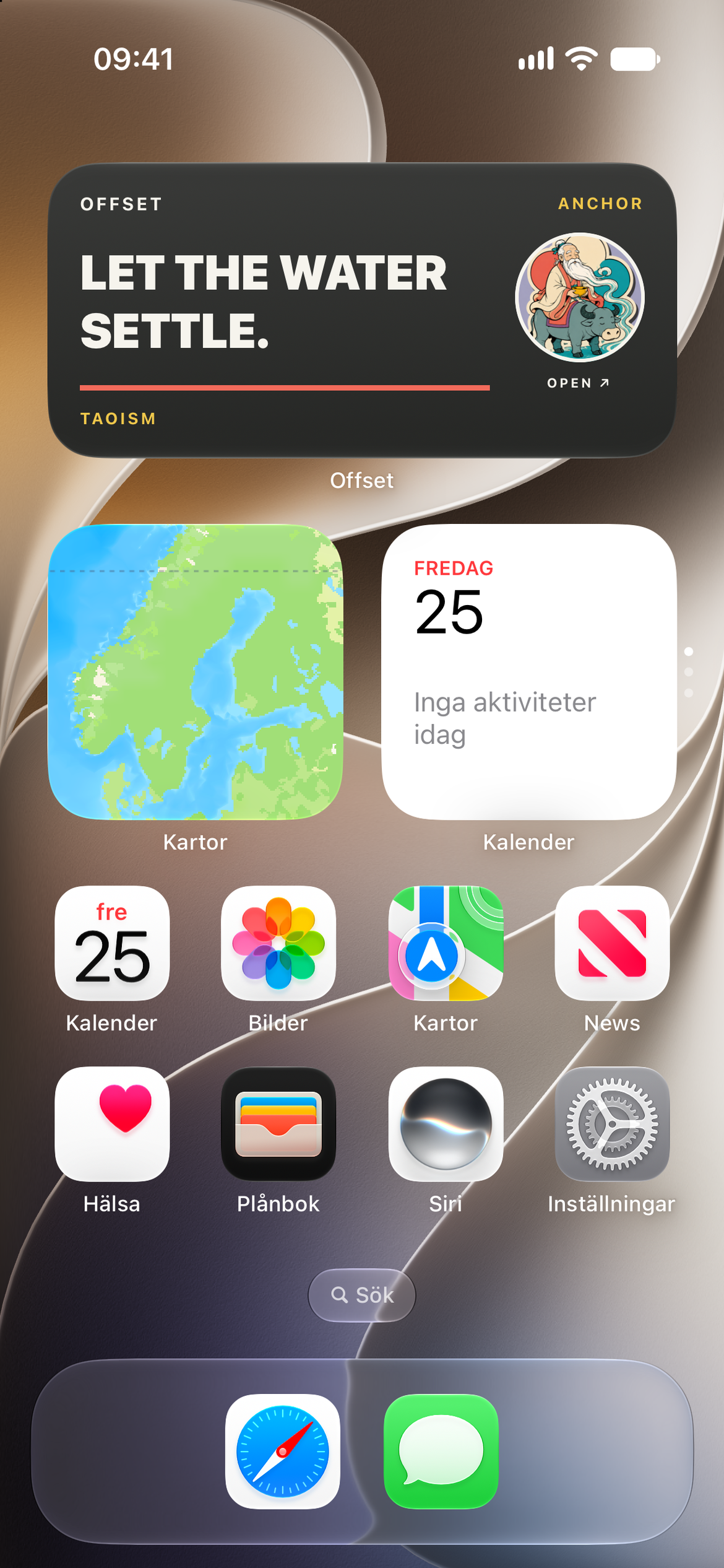
Keep what helps.
A chosen perspective returns as an anchor on Home and in a widget — no score, streak or performance report required.
OFFSET
INDEPENDENT PRODUCT · DESIGN & DEVELOPMENT
2026
08 / WHAT I CUT
Polish meant taking things away.
A final pass through the running app surfaced friction that static mockups hid. Almost every fix removed something instead of adding it.
09 / WHAT’S NEXT · PLANNED, NOT YET TESTED
What’s next.
The next step is to test whether people understand the flow without explanation, discover the swipe interaction and leave with a perspective they consider useful.